
Dialog
Dialogs are a versatile component that can inform users, contain multiple task specific actions, present important information or require decisions.
External resources
Fully implemented in LOGEX Framework
Anatomy
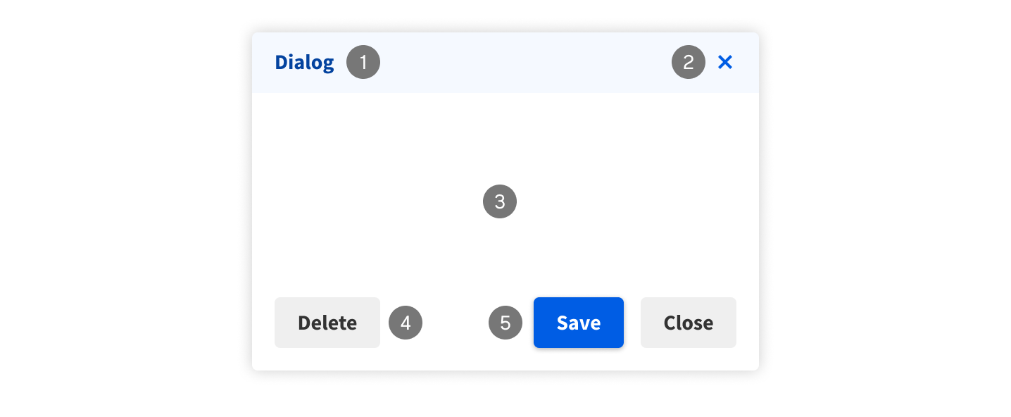
- Dialog header. Keep the title short and clear. Users should be able to click and drag the dialog header to move it around the screen
- Close button
- Content. This is flexible and can be anything, as long as it fits in the dialog.
- (Optional) Delete button
- (Optional) Action buttons
Sizes
Dialogs come in different size. Its size should be picked manually depending on how much content it will contain.

Usage
A dialog is a special type of window that appears over an application’s content to provide important information, to perform a task, or ask for a decision. Combined with a transparent overlay, it blocks the rest of the application until it is closed. Dialogs are intentionally disruptive. If dialogs appear without the user intentionally triggering them, they should be used sparingly as they can negatively impact the overall user experience of the application.
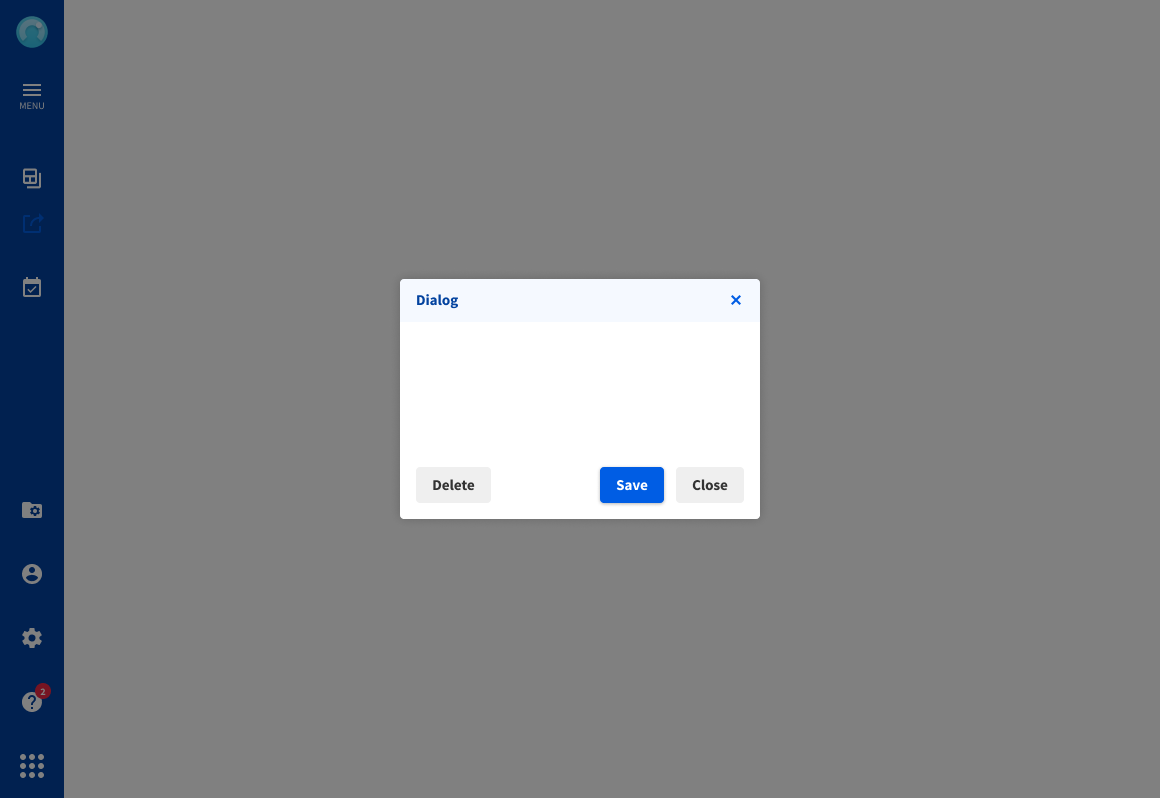
Using an overlay will ensure the user is focussed on the dialog, while it also blocks the rest of the Application. Clicking the overlay could close the dialog.

Without an overlay the rest of the application is still usable. Test TEST ETSGVHAVH

Center the dialog horizontally and vertically, whatever the size, whenever the dialog appears.
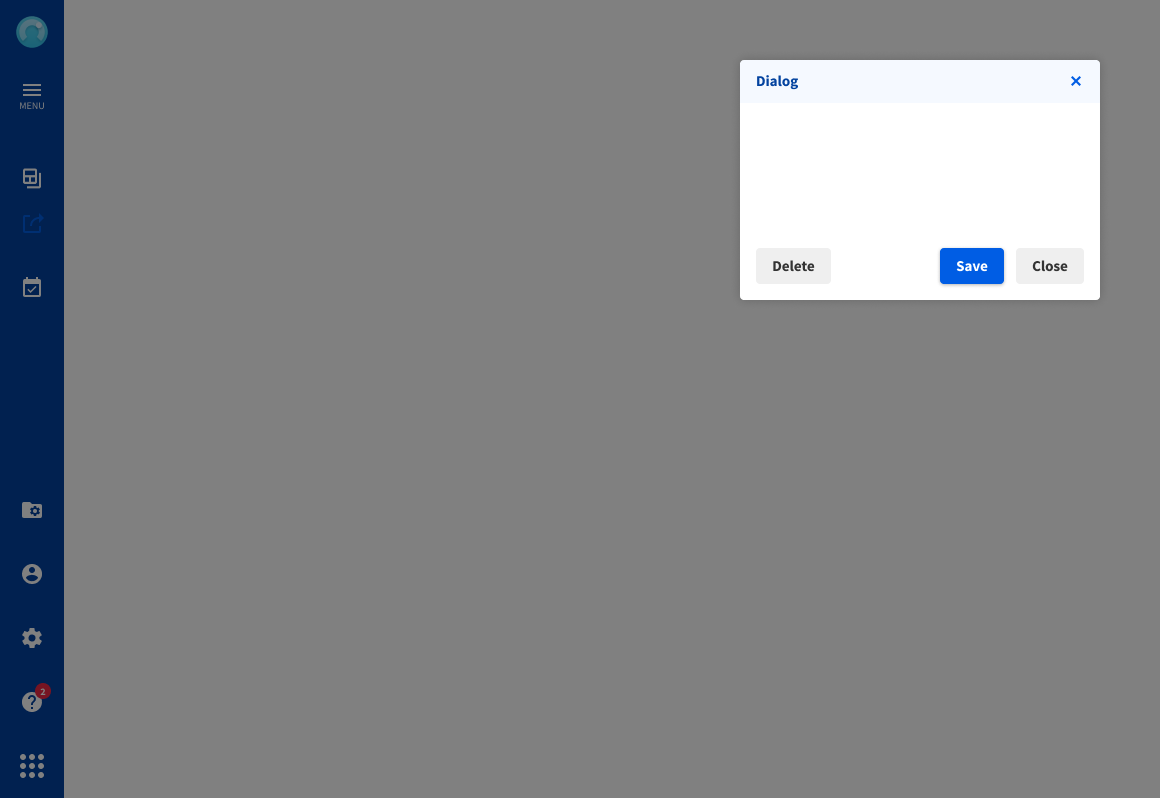
In some cases you might need to deviate from the standard center position. While it’s not ideal, it is allowed.

When dialogs are stacked make sure the highest level is focussed by moving the previous dialog to the background.

Opening another dialog next to the previous one results in a conflicting hierarchy. It will also cause scaling issues when using larger dialogs or smaller screens.

When using action buttons, use labels that indicate the outcome of the action

Avoid using vague labels for these buttons, as the user might not understand what ‘Ok’ will do.
When to use which notification
| Component | Priority | User action |
|---|---|---|
| Snack bar | Low priority | Optional: Snack bars remain until dismissed by the user, or if the state that caused the banner is resolved. |
| Top bar | Medium priority | Optional: Banners remain until dismissed by the user, or if the state that caused the banner is resolved. |
| Dialog | Highest priority | Required: Dialogs block app usage until the user takes a dialog action or exits the dialog (if available) |
Predefined dialogs
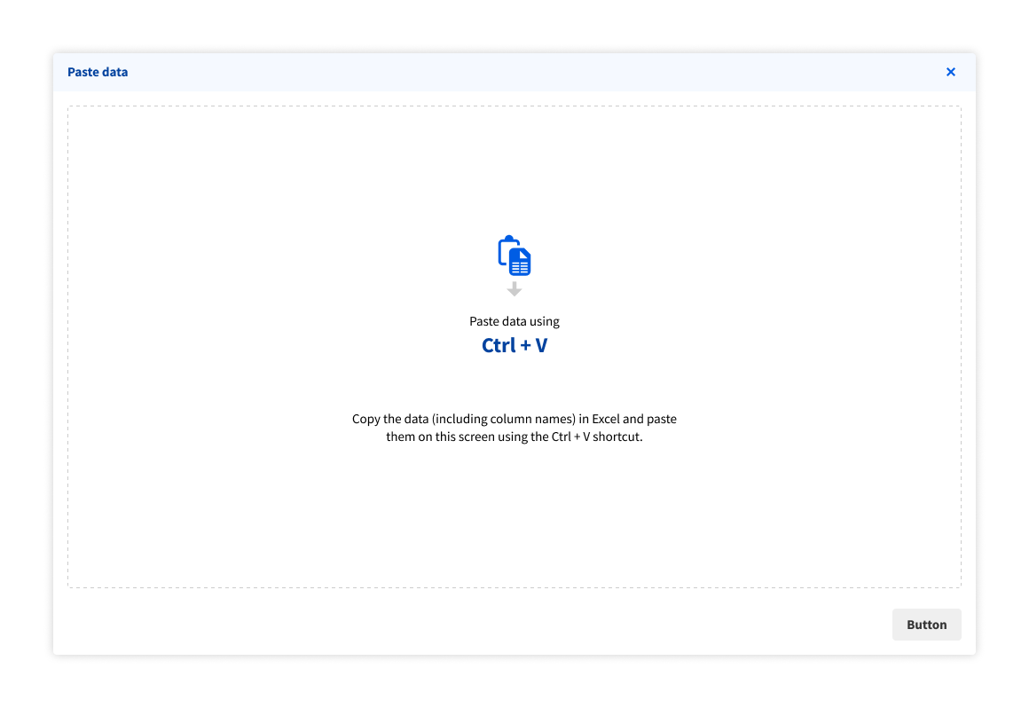
Paste dialog
This predefined dialog can be used to past and import data from, for example, Excel files. For more information on this, see import data field.