Graph tooltip
Graph tooltips provide valuable information and context to users when interacting with data visualisations. They improve understanding of the data being presented.
External resources
Fully implemented in the LOGEX framework
Anatomy
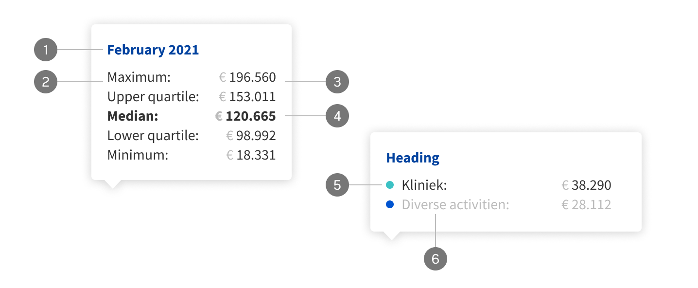
- Title, displaying an axis label
- Data labels
- Values
- Applied bold font weight to important data labels and values
- Colour form the graph element
- Unfocussed label and value
Variants
Graph tooltips are meant to be flexible. They can be used in many different ways, below you’ll find a few examples.

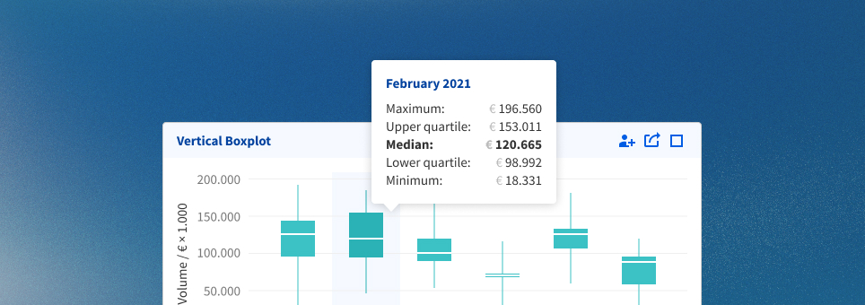
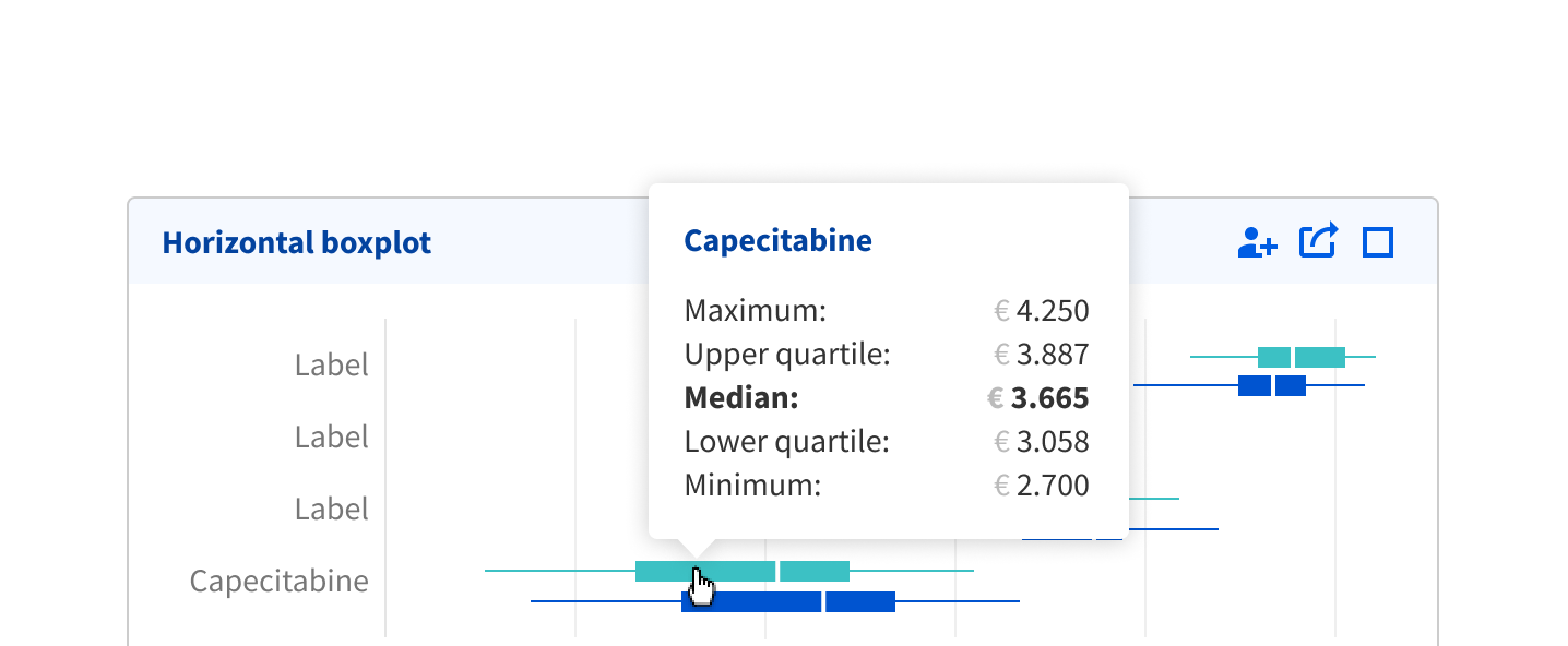
- Basic tooltip, showing only a single value
- Added comparison between own hospital and benchmark over multiple data labels
- Showing multiple data labels, highlighting the one that is currently being hovered on
- Multiple data labels, the most important data label and value are in bold
Usage
Hovering
The graph tooltip should follow the cursor, as it is generally best practise to show the information where the user is looking. Otherwise you have a separation between the target and information.

The graph tooltip should follow the cursor while when it hovers over the graph.
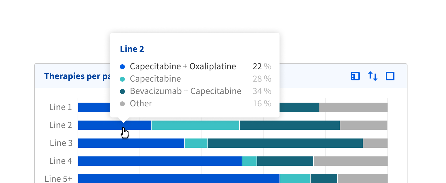
When hovering over a particular element of the graph, this value should be highlighted in case there are multiple values shown.
Prioritise information
Present the most critical information first within the tooltip. Users should be able to grasp the key details immediately, even if they don’t read the entire tooltip. This will also help keep the tooltip relatively small, so it doesn’t become disruptive.
Focus on just a single element in the tooltip.

A second element can be added for comparison purposes. However, this would increase the size of the tooltip significantly.

In this particular example, it’s unwise to add a third comparison. The tooltip is visually too large and too disruptive.

Do not restate labels for each comparison.