
Date and time picker
Date and time picker is used to select a date and time.
External resources
Fully implemented in LOGEX Framework.
Anatomy
Date picker

- Input field with a placeholder
- Opened input field with day/month/year highlight
- Month and year dropdown
- Arrows for changing months
- Go-to arrow to move to selected value or current date
- Header row
- Date (not selectable)
- Date (current date)
- Date (selectable)
- Date (selected)
- Select current date button
- Clear selection (if possible)
Time picker

- Input field with the selected date
- Opened input field with a highlight
- Dropdown body with example values
Behaviour
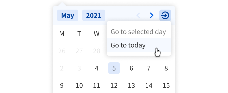
The go-to button allows users to jump to a screen with selected or current day (if possible).

The input field is keyboard friendly and it guides users by highlighting the day/month/year.
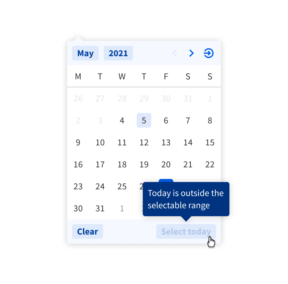
When the current day is not in the allowed range, there is an explanation tooltip while hovering over the button.

When the allowed range is limited an explanation tooltip is shown above the time picker.