
Text field
Text field is used when the user needs to fill in the text in the interface.
External resources
Fully implemented in LOGEX Framework.
Variants
Single- and multi-line
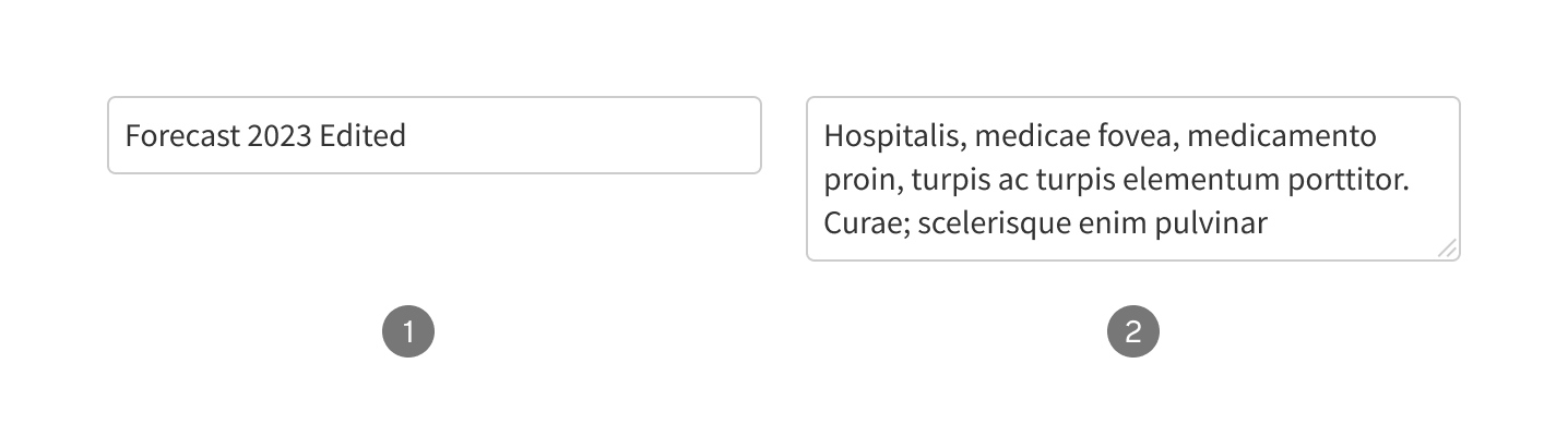
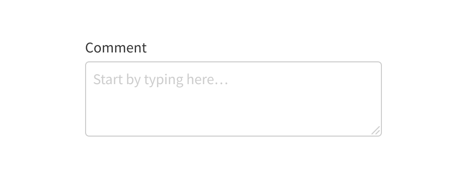
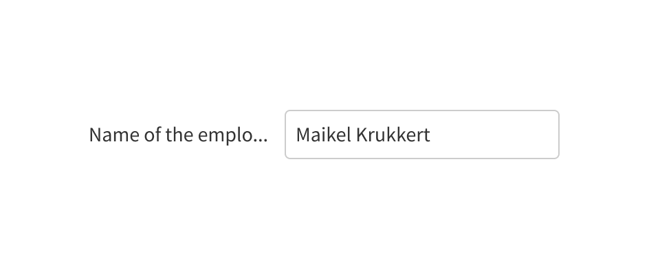
There are two main variants: single- and multi-line text fields. The single-line text field is used to fill in short information such as name, department, or cost. The multi-line text field is used for longer texts, such as comments.
- Single-line text field
- Multi-line text field
Prefix and suffix
The fields can be accompanied by a prefixed or suffixed value (such as a currency symbol or a percentage). By default, this symbol is subtler and during input hidden entirely.

- Only value
- Prefix text
- Suffix text
Anatomy

- Label
- Input field
- Placeholder
- Draggable icon
Usage
Label
The label is always required.

Place the label to the left of the field.
Place the label on the top of the field.

Keep the label short and clear.
Do not use long labels and never truncate them.
Other elements
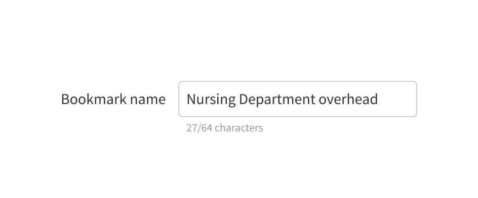
Use supporting text to help the user or to show additional information such as a character count.

If some fields are required, indicate them with an asterisk.