Graphs in general
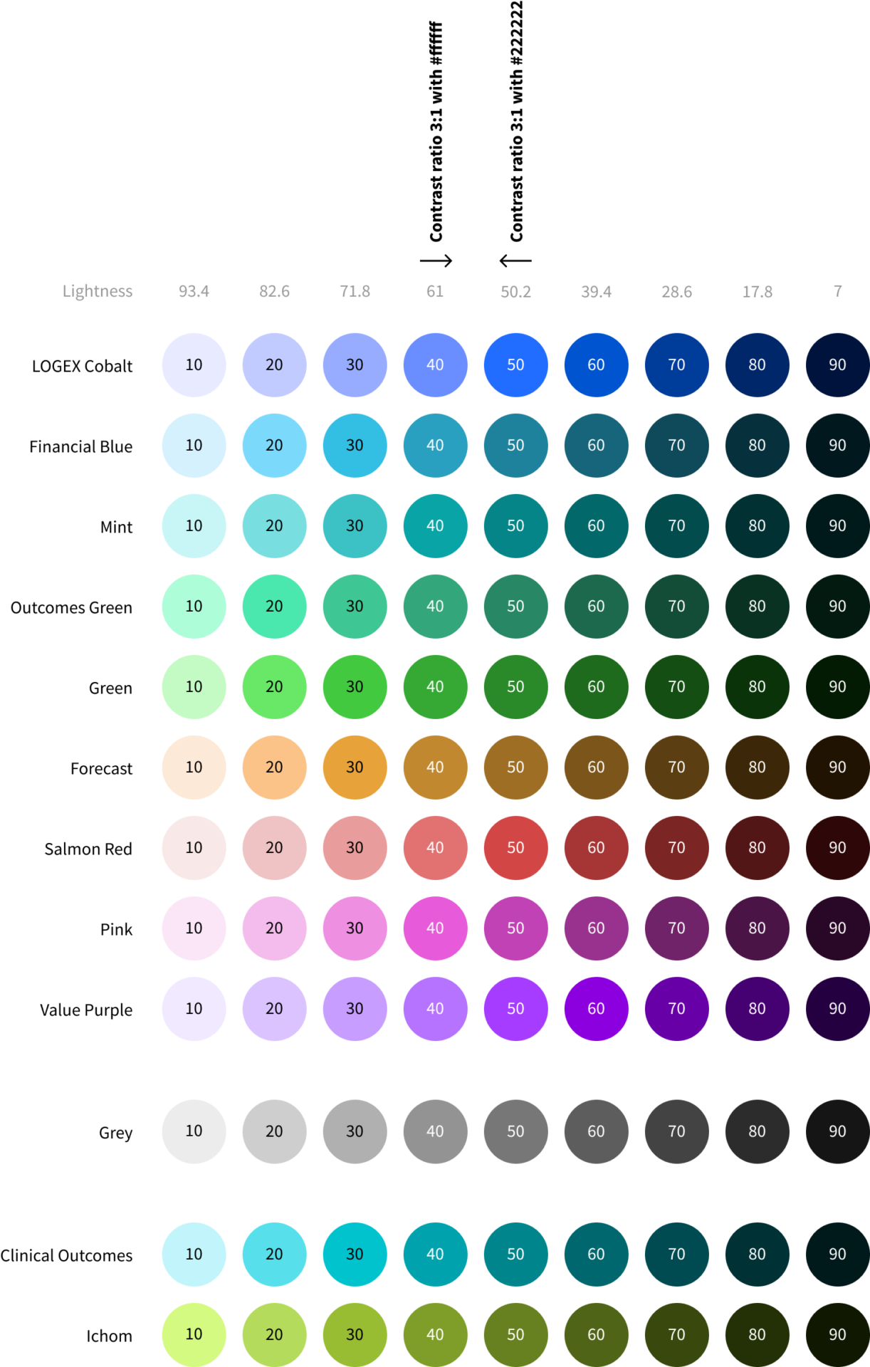
The graph palette has 9 shades for each color. The shades marked 40 and higher have sufficient color contrast with white color and are thus usable on white backgrounds. Alternatively, colours marked 50 and lower have sufficient contrast with black color and are usable on dark backgrounds (for example in a dark mode).
Types of palettes
Below you can find the basic examples of how to work with the new colors. Always discuss the colors in a graph with the design team.
Categorical palettes
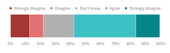
These palettes are used when the variable can be assigned into one category. Examples of categories include insurer, hospital, and department.
The colors in this palette should be applied in a strict sequence defined below. The sequence was meticulously curated to help with visual differentiation. The sequence has in total 20 colors (below you can see the first 10), but we highly recommend keeping these at a minimum. If you find your graph having more than 8 categories, consider visualizing the data in a different way. Below you’ll find the first 10 colors of a curated categorical palette.

For evaluating the categorical palette, we used Viz Palette, which allows users to see the palette as it would be visible to people suffering from visual impairment. On the left you’ll see an example of the categorical palette.
Sequential palettes
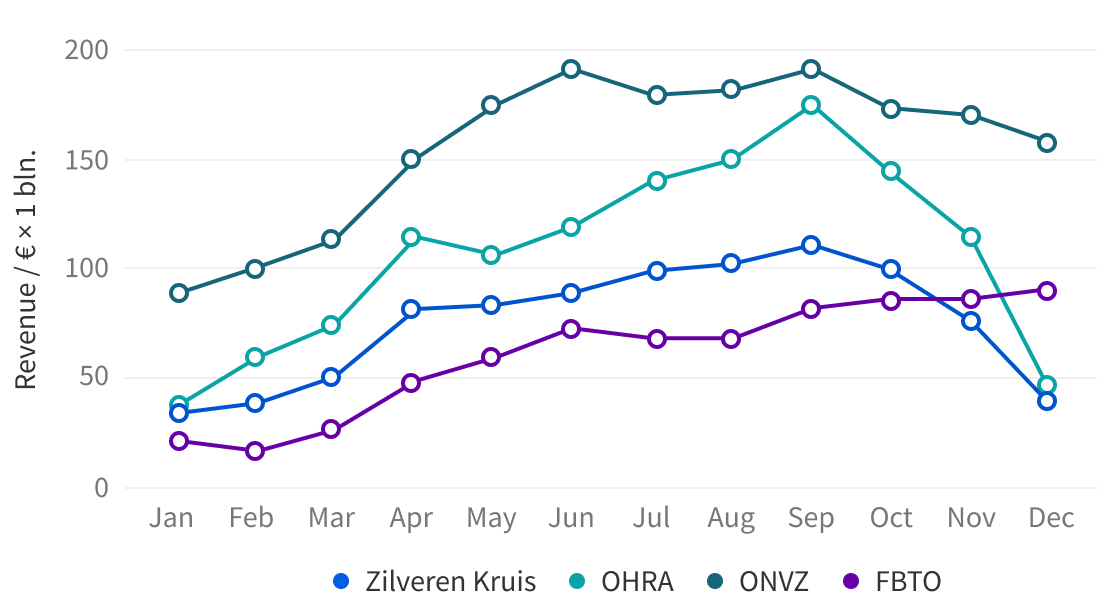
We can use a sequential palette when we assign numerical or ordered values to a variable. This variable can be for example a province, as shown below.


Diverging palettes
If a numeric variable has a meaningful central value, we can use diverging palette. The diverging palette consists of two sequential palettes connected together with central, grey color.
Divider lines
Thanks to the improved palette, we have achieved better contrast with the background. But what about the contrast between the colors themselves? For that many colors, it is impossible to create sufficient contrast and retain aesthetically pleasing results.
For that reason, we have decided to introduce 1 px thick white lines between each element of the graph. This change alone makes a huge difference.

Labels
All graph labels’ font sizes have been increased to 15 pt and the color is darker and more consistent throughout the graphs. Thus, all labels have now sufficient contrast and pass the WCAG. In the section below, you can find before and after examples.