
Combobox
Combobox is used to select multiple options from a list.
External resources
Fully implemented in LOGEX Framework.
States
There are 3 states of collapsed combobox. When nothing is selected, it looks like a normal input field. When elements are selected, there are two modes of indication: it either shows the items followed by “+N more” or it just shows the number of selected items (“N selected”). The first option is recommended when the user commonly selects just a couple of items.
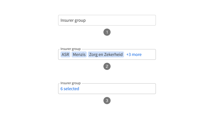
- Not selected
- Selected
- Selected without preview
Anatomy
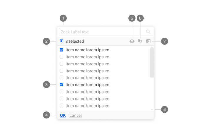
- Search field
- Bulk selection checkbox
- Item
- Bottom bar (optional)
- Show only selected (optional)
- Sort (optional)
- Invert selection
- Scrollbar