
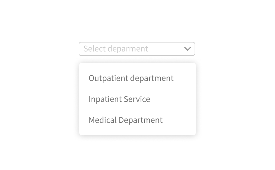
Dropdown
Dropdown is used to select an option, take action, and configure settings.
External resources
Fully implemented in LOGEX Framework.
Variants
There are two main variants: default and condensed. Where possible, use the default variant. The condensed variant is ideal to be used in places where the space is sparse, such as inside other components.

- Default size
- Condensed size
Anatomy

- Collapsed body
- Placeholder
- Dropdown arrow
- Dialog body
- Additional icon
- Search bar (optional)
- Item
- Separator
- Icon (optional)
- Sub-level arrow
- Sub-level dialog body
- Group header
- Scrollbar
Behaviour
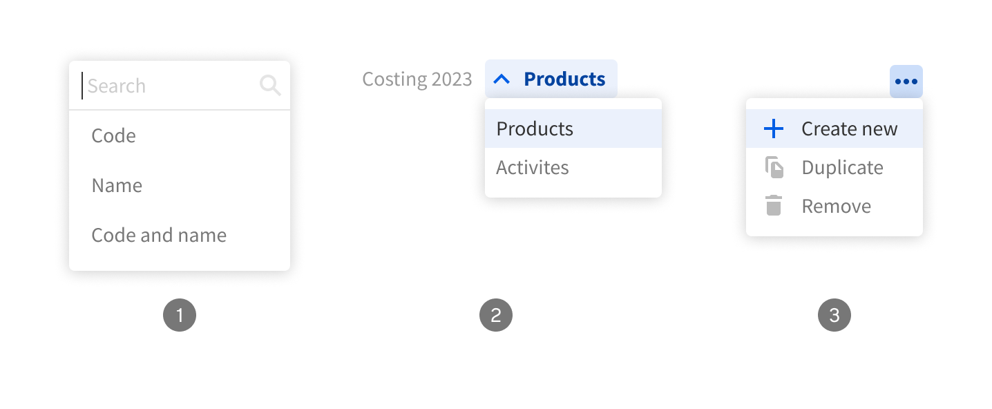
The dropdown dialog can be opened from various components. For example from:
- collapsed dropdown,
- breadcrumb item,
- or an icon button…

The dropdown dialog opens according to the screen space. If there is not enough space or the height is limited by the design, the dialog content becomes scrollable.
Usage

Use consistent sizing between the collapsed dropdown and the dropdown dialog.
Don’t use different sizes between the collapsed dropdown and the dropdown dialog.